


Summary: The market is sending two different signals depending on where you look. Broad breadth is at new all-time highs — but Nasdaq members are barely keeping their heads above water, and Trend Fragility remains elevated. Expect continued chop and volatility, with a possible shakeout of 6% or less before this resolves. Outside of tech dragging on the SPX and Qs, the underlying tape is constructive. We ultimately expect an upside breakout from the larger sideways ranges in both. Bonds keep compressing, and our growth indicators are pointing higher — which means that breakout in rates is more likely to be up than down. The market remains grossly underweight cyclicals. Oil is overbought but far from overloved. And one biotech stock looks like it’s ready to run.
MO Portfolio & Trades
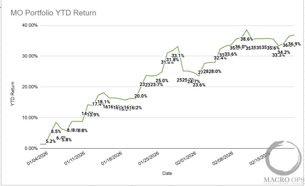
1. The MO portfolio gained +120bps last week, helped by our longs in silver and miners. It’s now up +36.9% ytd, still below its ytd NAV high of +38.6%.
If you’d like to join our Collective, click here.
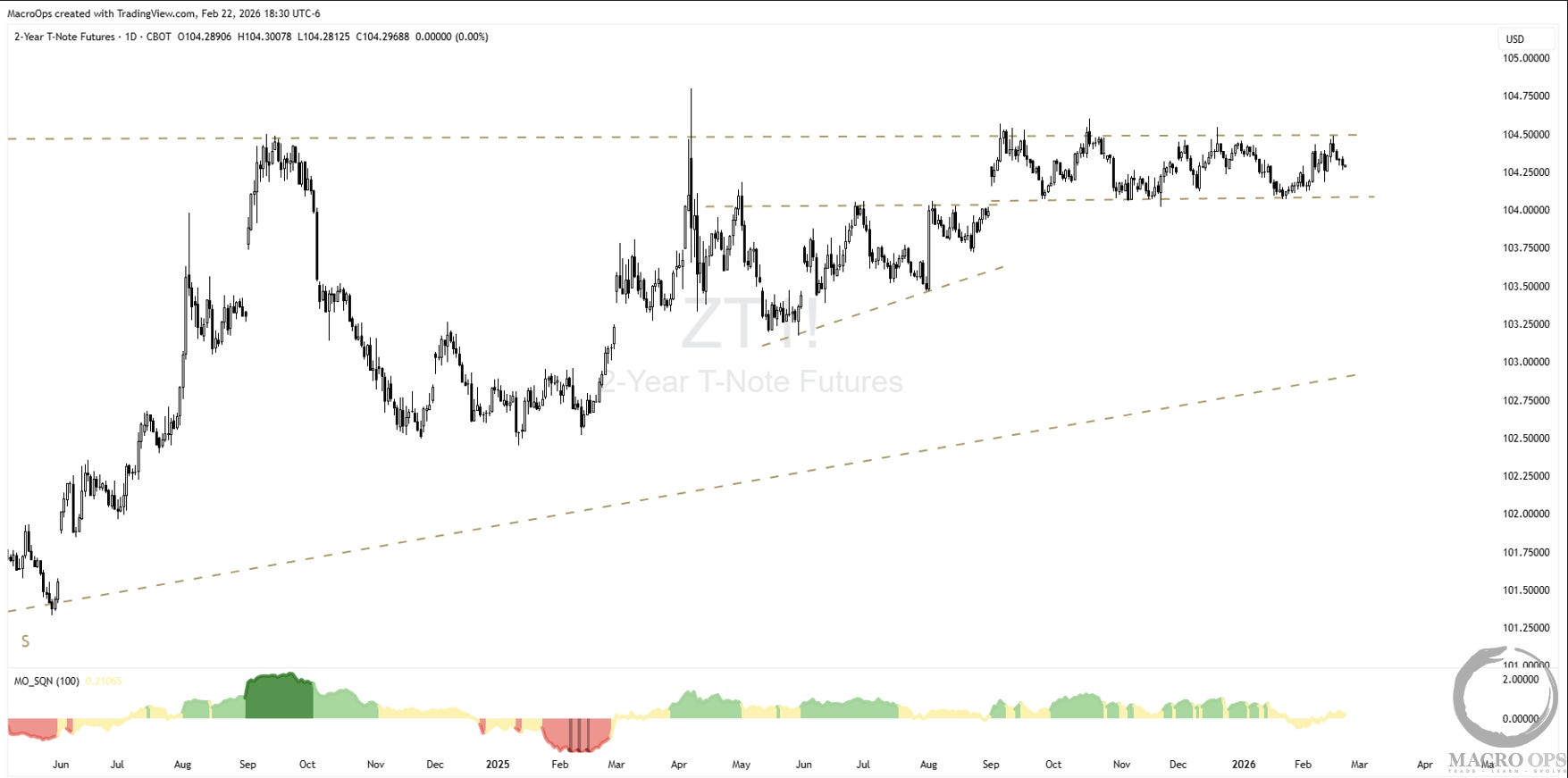
2. We will keep covering this one until there’s movement. The 2yr Notes remain the most compelling setup in markets. We have compression regimes within compression regimes. Translation: a big move is coming. We don’t know which direction yet — so we stay ready for both.
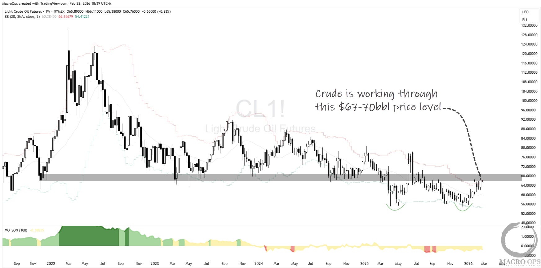
3. We are also quite long oil and E&P stocks. This is a Trifecta setup — bearish sentiment and positioning, accelerating global growth, and a potential double bottom bear trap in the chart — and an event trade, as we expect a major Iran strike at some point in the weeks ahead. This event risk can cut both ways, so we need to be nimble on this one.
Trifecta Charts
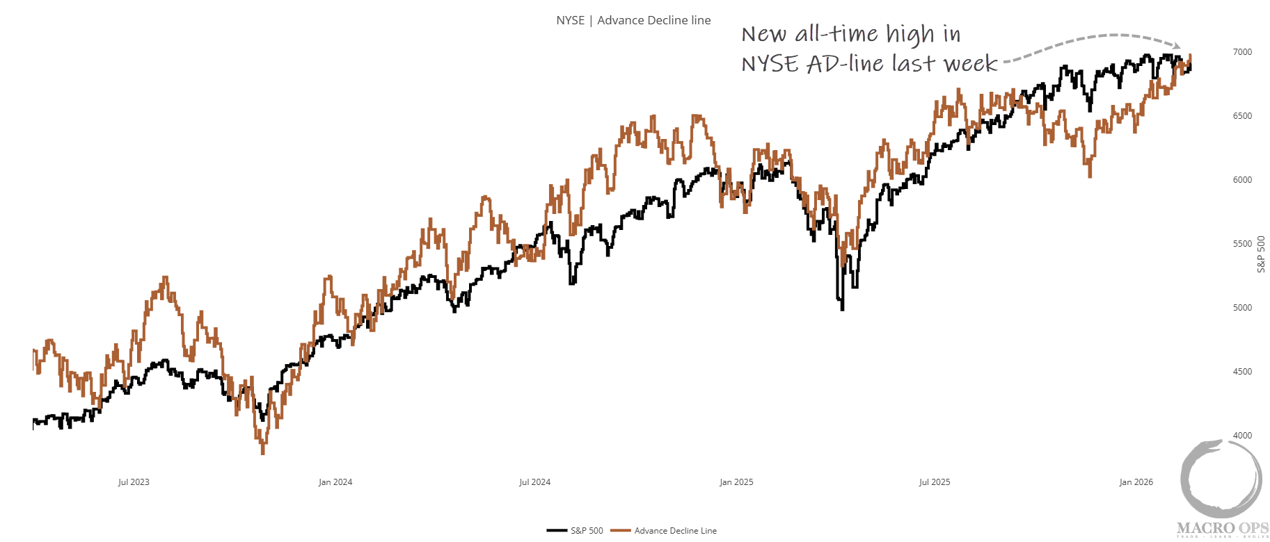
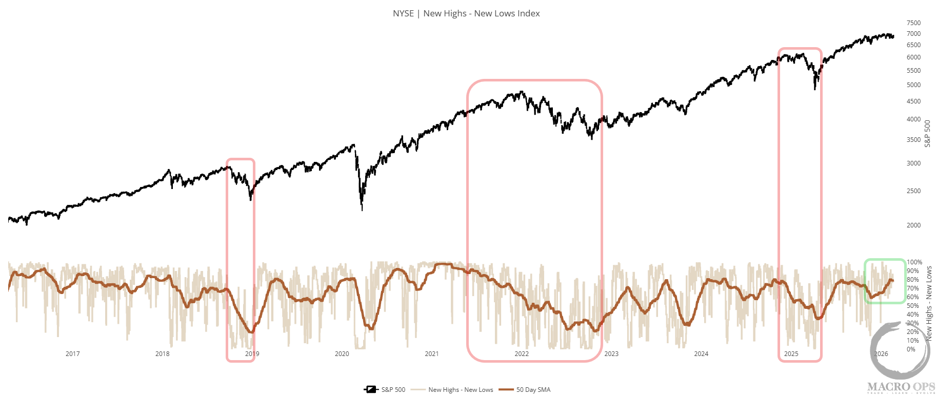
4. Breadth tells two different stories depending on which part of the market you’re looking at. Here we have the NYSE A-D Line making a new all-time high, diverging higher from price. And the NYSE New High-Lows Index showing underlying action that’s typical of a strong bull.
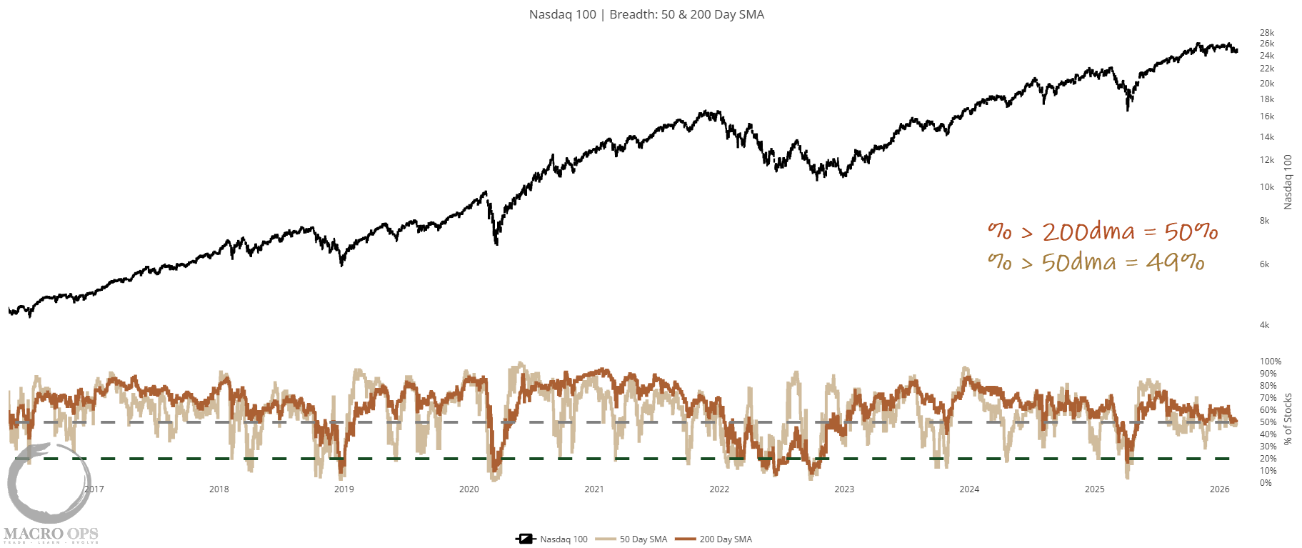
5. But tech continues to trade heavy, as shown below with the % of Nasdaq stocks trading above their 200 and 50 day moving averages as just 50% and 49% respectively. Any further deterioration here, and the Qs start rolling over.
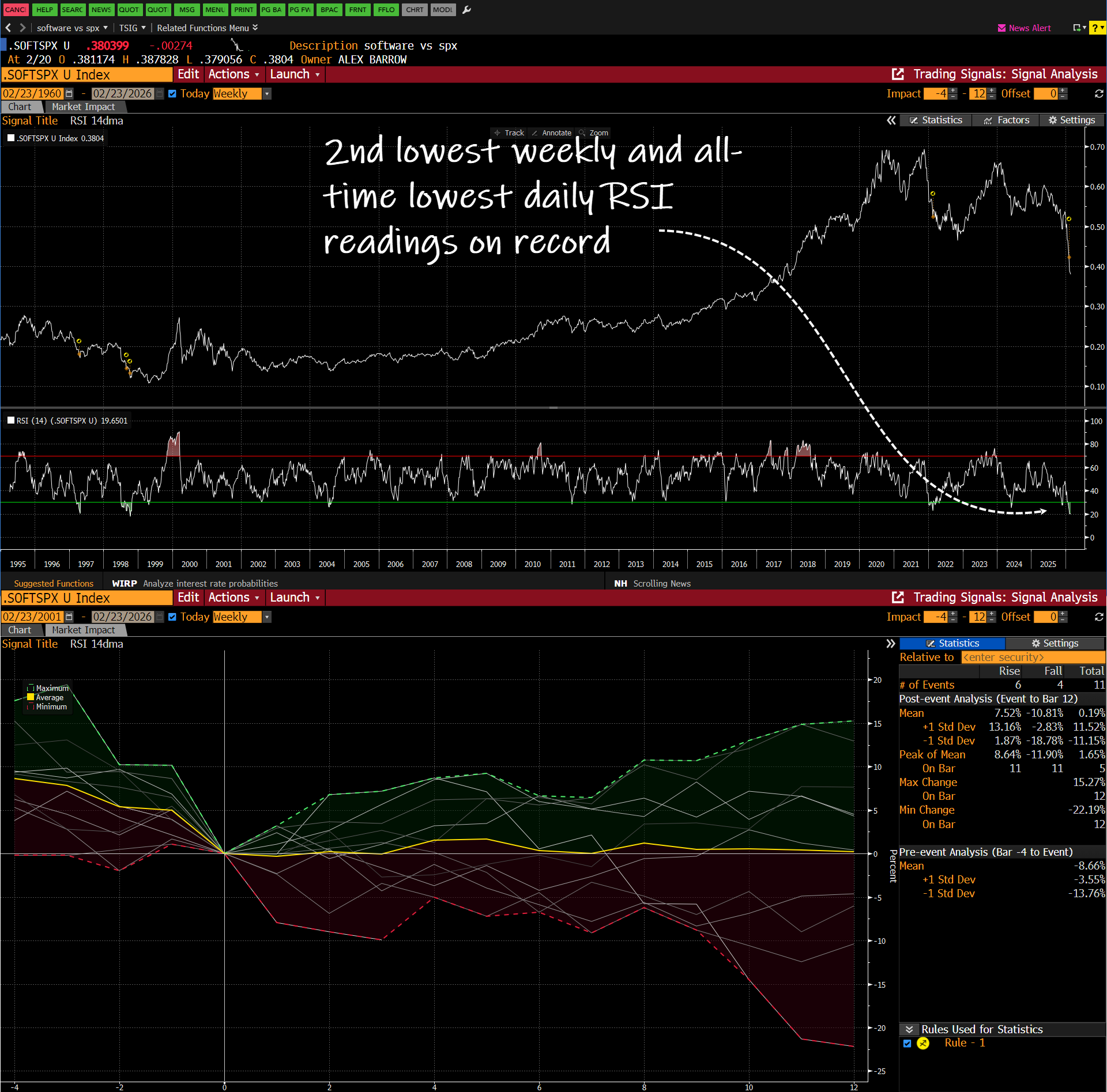
6. Obviously, the worst of this weakness has been concentrated in the Software sub-industry. The chart below shows the S&P 1500 Software sub-industry group vs. the SPX. As you can see, the past few months have been one of the most dramatic periods of relative underperformance on record, with the daily RSI hitting its lowest level ever and the weekly its second (97’ being the worst).
Your instinct says mean reversion — big underperformance like this should snap back. But history disagrees. Average forward 3-month returns after setups like this: essentially flat.
I know a LOT of money — mostly retail and HFs — has piled into the software space, trying to catch a bottom. Data shows institutions are selling to them, and my belief is that the knife catchers will get bloodied hands. But we’ll see…
Macro
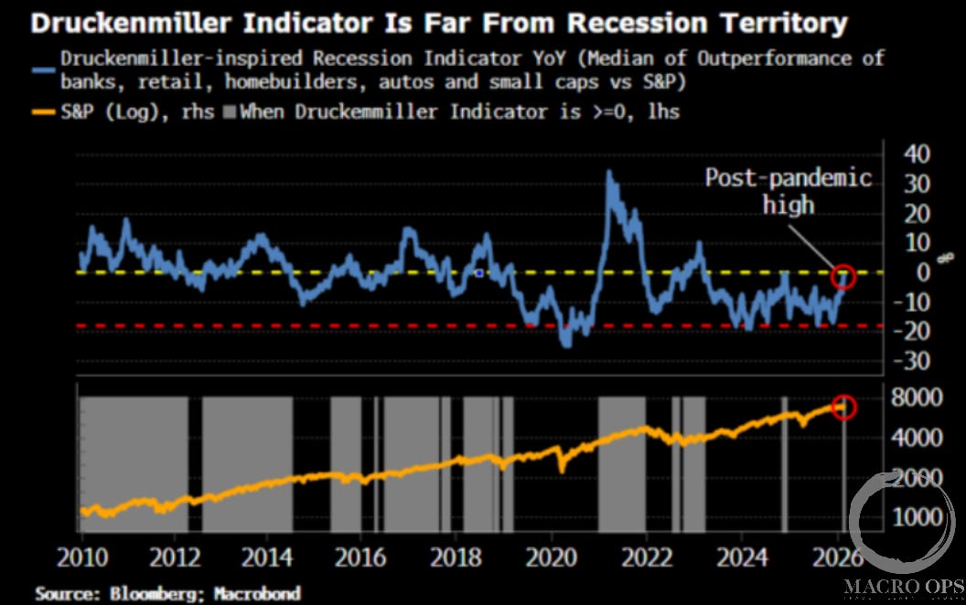
7. We’ve been writing since last winter about the pickup in global growth, and that trend continues to be borne out. Last week, I saw this great chart from a piece by BBG’s Simon White showing what he terms the “Druckenmiller Indicator”. I’ve long used something similar, but the idea is that Druck looks at leading cyclical industry groups, in this case (banks, retail, homebuilders, autos, small caps versus the SPX) as a lead on broader markets and the economy. It works because markets are mostly smart — there’s wisdom in the crowd.
This, along with all our other indicators, tells us recession risk and the risk of a broader bear market are very low.
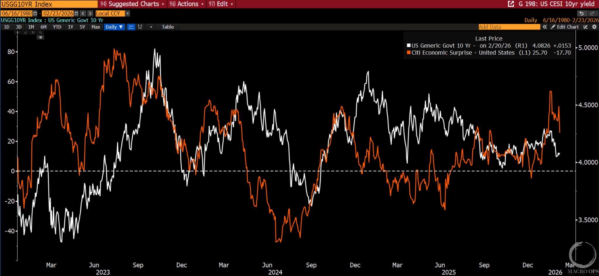
8. I’ve been spending a decent bit of time sifting through charts to see if I can get more of a feel for which direction this compression regime in rates will resolve itself. The chart below shows CESI - Citi’s Economic Surprise Index (orange line) and the 10yr yield (white). A few weeks ago, CESI hit its highest reading since mid 23’. It’s since come off a bit following last week’s disappointing GDP print, but those numbers were distorted by November’s government shutdown — strip that out and the read was strong. We expect more positive growth surprises ahead, which should act as upward pressure on rates.
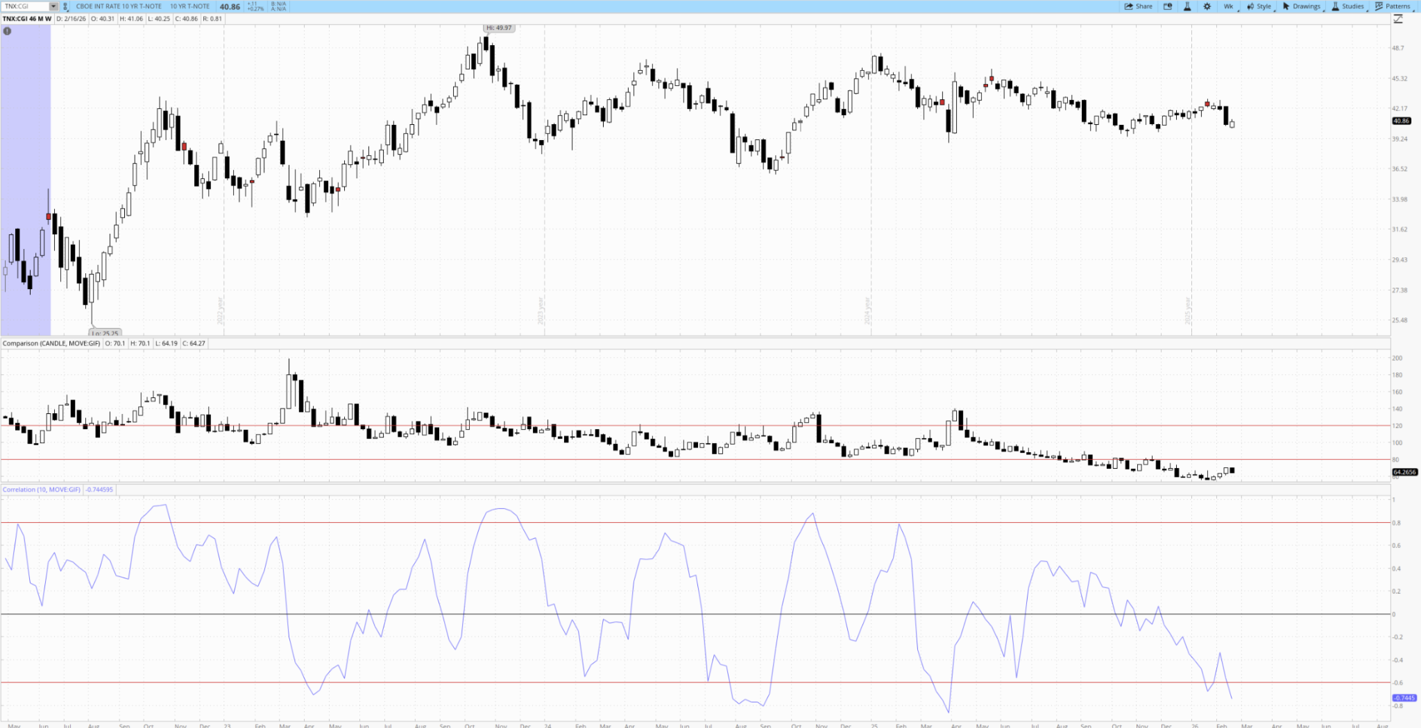
9. Fellow MO teammate resident vol expert, Tony (@vixedsignals), shared this great chart in his latest Vol Street Journal (you can watch here) showing the weekly chart of the 10yr yield, the BofA MOVE index, and the 10-week correlation at the bottom. Tony points out that:
“The correlation is very low due to the MOVE index climbing since late Jan while rates have dropped. Extreme correlations like this have historically preceded a spike in rates. With the MOVE index already so low, it’s reasonable to think that the correlation normalizing will happen with rates turning higher.”
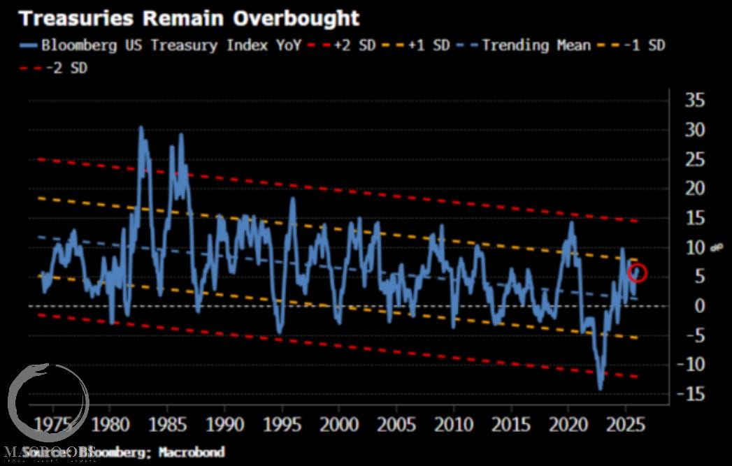
And one more follow-up bonus chart that’s also suggestive of rates breaking higher (chart via Simon White).
Trade Setups / Topical Charts
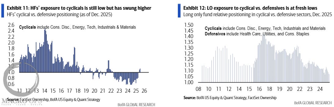
10. While a number of cyclical industries have been on a tear these past few months, and are arguably overbought over the very short-term. The two charts below from BofA show that, from a repositioning standpoint, this trend is very early days. Imagine AI continues to rerate software lower, but strong growth and flush liquidity keep this from becoming a broader cyclical bear. That money has to go somewhere. And that somewhere is international equities, commodities, hard assets, and cyclicals. And the relative difference in market caps is so large that, well, we can see some wild moves.
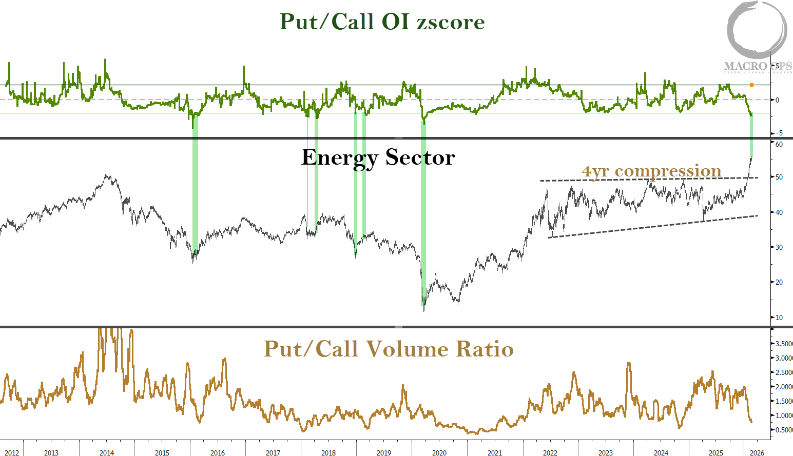
11. As I said, we’re quite long the energy sector. And it is one of the cyclical sectors that is short-term overbought, by any measure. So we should expect a pullback and some consolidation at some point.
But… I don’t believe we are anywhere near even an intermediate top, let alone a cyclical one. Again, the total relative market cap of energy versus, say, software has become so tiny that it doesn’t much of the way to a reversal in flows to rerate the sector massively higher. What’s interesting is that most of these flows are unhedged, as indicated by the low put/call scores, suggesting that institutions are likely allocating here with more patient capital.
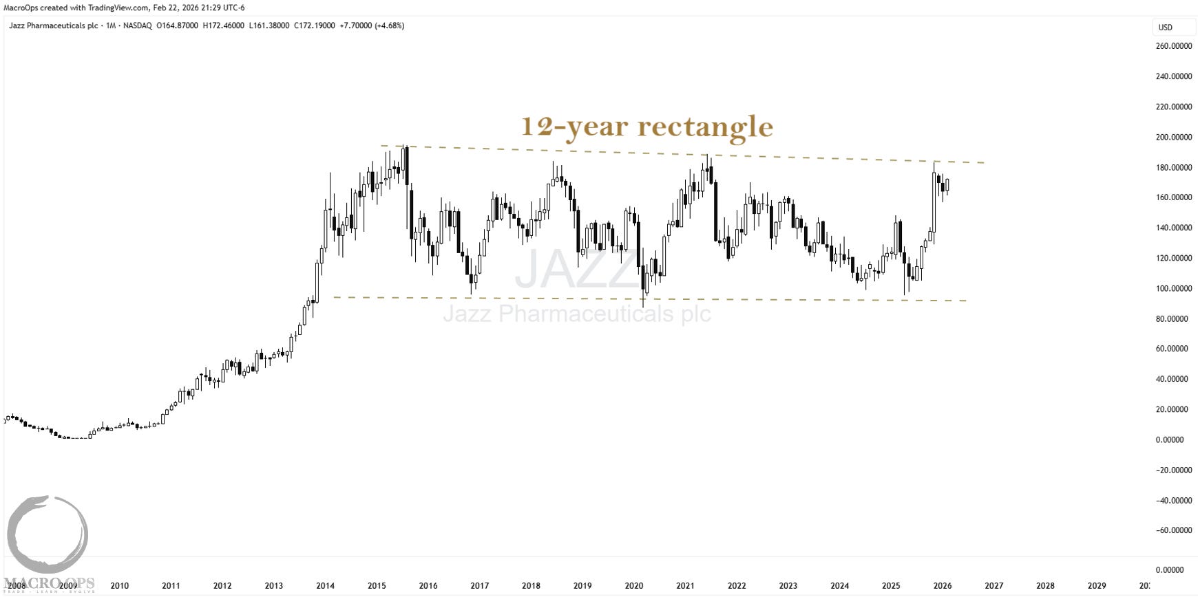
12. This is a monthly chart of Jazz Pharmaceuticals (JAZZ). It’s near the upper-range of its 12-year rectangle. It’s in the lower decile of its relative performance to the biotech sector. Earnings are on Tuesday. If earnings surprise, this one could move fast.
Join The Collective
Thanks for reading.
Your Macro Operator,
Alex